Website Design for SEO
Designing a Visible website
When designing a site, the most important factor in its development is ensuring that it is built upon a sound SEO foundation of techniques and optimizations that will land you front page real estate on search engines. The more SEO friendly your site is, the higher its rankings and visibility will be on search engines, which directly translates into more conversions and organic, or unpaid, traffic.
To find the pages on your site, search engines use web crawlers to document and index all websites and to rank and display them in order based on their SEO friendliness. The success of your site through search engine visibility is determined by your ability to help these web crawlers see and understand your site’s content and purpose.

Content Management, Hosting, & Domains
A Content Management System (CMS) is a program or service that is used to create or modify web content. Joomla, Drupal, and WordPress are the most commonly implemented types of CMS. WordPress is a great starting point for any business, with over 59% of all sites using a CMS using it. These systems offer many optimized features like: themes, plugins, mobile friendly customization options, SEO friendly links, integrated support, and extensive modularity that make a webmaster’s job much easier. Choosing the right CMS that has the features that you need is just as important as what you right on the pages of your site.
Hosting is the service of providing a physical storage location and internet connection for a website. Choosing the correct hosting service that offers fast and reliable page speeds to your user base is crucial in your site’s success. Again, WordPress offers a great service for hosting with WP Engine that is optimized for use with WordPress site layouts.
Lastly, choosing a simple and relevant homepage URL or Domain will help land you a better chunk of traffic. Overly optimized, keyword stuffed domain names like BuyTheBestProductsHere.com are proving to be less effective than simple and concise domain names as Google updates its algorithms to find content more relevant to users.
Website Structure and Information Hierarchy
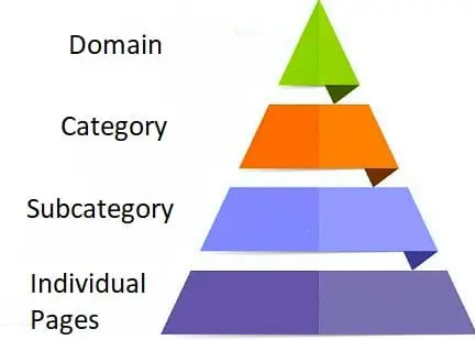
Designing the structure of your site to be logical & simple to navigate is critical in offering a presentable selling point that does not frustrate or confuse users. The main page should be supported by noteworthy categories which have subcategories and individual pages within those.
Domain -> Category -> Subcategory -> Individual Product/Service. Content should not be divided into subdomains on your site, but rather into categories within a primary domain.
Having a website Navigation that is wholistic and relevant to all pages is also important. Again, creating a well mapped site that is easy to navigate will drive a positive user experience that will help your site ratings and rankings over time. All of the content on your site should be well connected to other relevant content on your site creating a robust, internal linking network that helps users navigate with ease.
Page Speed – Cache, Compress, & Optimize
In the 3 seconds it can take your website to load, you may have already lost up to 50% of the incoming traffic. Page speed, or the page load time, is important because it relates to how quickly users click away from the page. Things you can do to optimize page speed:
- Optimize JavaScript, CSS, & HTML: Compressing CSS and JavaScript, optimizing code to exclude unnecessary characters such as commas and spaces, removing comments and excessive formatting in code.
- Enable Site Compression: Reducing the size of any files on a page over 150 bytes via compression can have a drastic effect on load times.
- Image Optimization: All images should be the exact size to fit into their place on a page. Choosing the correct file format (PNG, gif, JPEG) is also important as it affects the image quality and size – choose a file format that allows the image quality you need at the lowest available size.
- Reduce Redirects: Links to your site that redirect will ultimately slow the page speed down. If a link does not directly go to the destination, it must redirect through multiple URL’s which slows the page load speed down. Redirects mainly become an issue when your site is changing URL’s within the domain, such as when switching the entirety of a website from unsecured to secured which changes http -> https in all of the site URLs.
2017 Is the Year of Mobile
Mobile phones are quickly becoming the most used device when browsing the web. Mobile growth is overtaking desktop so quickly that Google is starting to change their ranking algorithms to prioritize sites that have mobile friendly designs. According to Google, it is no longer acceptable to simply have a responsive site design when it comes to mobile optimization, as users are five times more likely to leave a site if it’s not well optimized for mobile use.
These are red flags for Google’s ranking of your site’s mobile friendliness:
- Viewport Not Configured: Viewport meta tag exists specifically to help browsers understand how you want the site to scale for a different device. Make sure your Viewport is configured.
- Flash Content: Currently, the average mobile browser does not render Flash content, so avoiding the use of Flash for your site makes it more mobile friendly.
- Content Not Sized to Viewport: If the content is too large for the window, a mobile user will have to scroll down further to see it all and this will hurt your mobile friendly score.
- Font Size Too Small: Some sites encounter a scaling issue where the text size for mobile users is far too small and requires zooming in to read. Make sure your content scales properly.
- Touch Elements Improperly Placed: Remember that mobile users interact with their screens via touch instead of a mouse. So, if content on your site is placed too close together, it can be a nightmare for a mobile user to activate it without touching neighboring elements.
- Interstitials: Full screen popups generally create a horrific mobile experience on your site. Google has specifically included demerits in their ranking algorithms for sites that use “intrusive” advertising that covers content.
Thankfully, Google has released some great tools for measuring your mobile friendliness:
Our Process of Designing & Improving Websites:
- Site Analysis: In-depth review and audit of your current site (if there is one) and categorization of areas and concepts needing improvement.
- Project Planning and Scope: This involves the laying out of all the required elements that will drive the site’s success as well as conducting Competitor Research and analysis.
- Website Design: Choose site themes, colors, and layouts. Design is then optimized for SEO intentions.
- Responsive Design: Our process of ensuring that the site is friendly for Desktop, Tablet, and Mobile phone users.
- SEO Elements: Implementation and review that SEO elements are present and functioning properly.
- Deploy Website: Rolling out of the new website and monitoring it for significant changes.
- Dynamic Review: We constantly analyze webpage performance and rankings and will test varying improvement strategies out on your site.
- Support: Our teams are available 5 days out of the week to offer support, idea, and solutions for your site.
Increase Organic Traffic & Conversions with Web Design Experts at CaliNetworks
With over 15 years of experience in web design and SEO, our marketing experts at CaliNetworks can keep your site looking professional and ranking well in the constantly changing environment of search engine results. Increase your organic traffic with seasoned SEO experts who can analyze, design, and offer you the support you need to create a successful site for your business. For questions or a free quote on web design services, contact us today at 805-499-7700.
>> Next Step: Mobile Site Design
<< Previous Step: SEO Copywriting